Ecommerce Checkout Page Optimization: 6 Actionable Steps to Win You More Sales, More Emails and More Trust
Paul Rogers
Checkout page optimization is a frequently overlooked area for retailers looking for routes to increase online revenue.
Instead, many online business owners and managers focus on optimizing for the front end of the website –– creating beautiful designs, site experiences and merchandising product to push customers down a purchase funnel.
That makes sense. After all, this is your customer’s first impression of your business, and your first opportunity to convince them to stay, browse and buy.
But when it comes to buying, an online store’s checkout far surpasses any other element of the website in terms of importance — including CTA buttons, product page specifications, and other more commonly thought-of factors.
This is the time when you — unknown retailer — present risk to the consumer. There is a reason that 7 out of 10 shopping carts are abandoned. 20+ years after the advent of ecommerce, consumers are still wary of providing sensitive information such as credit card details unless a retailer can prove that it is trustworthy, secure and worthy of the sale.
There are multiple ways to increase consumer trust with your product at the checkout page. Further, there are multiple ways to reduce abandoned carts on the product page, in the shopping cart and at checkout.
I’ll cover all of these in this post, helping you to address the below reasons of why people abandon cart other than because they aren’t ready to buy.
Here is that full list:
61%: Extra costs (shipping, taxes, fees) were too high
35%: Didn’t want to create an account
27%: The checkout process was too long or complicated
24%: Couldn’t see or calculate total order cost up-front
22%: Reported the website had errors or crashed.
18% Didn’t trust the online store with their credit card information
16%: Delivery timeline was much too slow
10%: Didn’t believe the returns policy to be fair or satisfactory
8%: Didn’t see their preferred method of payment
.5%: Their credit card was declined
Now, it’s worth saying that I don’t believe there’s such a thing as an optimum checkout process. The results will always differ based on the demographic, product complexity, price point and various other variables and the best results are likely to come from continuous testing, monitoring and improvement.
However, I’ve worked on a number of checkout projects with merchants over the last few years and this post based on many of those experiences.
Here are the actionable tips I generally give to ecommerce businesses looking to improve their checkout experience and gain more from merchants who have started the process.
1. Capture the user’s email address early
This tactic helps to address issue #1 and #2 in our abandoned cart list above.
Whether you like it or not, you’re never going to convert 100% of the users who reach the checkout page (or progress from the cart) – not even close. So, one thing I’ve always tried to do is grab the email address as early as possible, often as an independent first step.
This first step requires the user to enter their email address and choose whether they want to check out as a guest or create an account for later use. It also ideally performs a lookup to tell the user if the email address already has an account associated with it.
Hyphen Mattress has a really strong checkout experience and is a great example of how an initial email / user validation stage can be done as a first step (i.e. grabbing the email address). With either checkout process — checking out as guest, or creating an account — the first step is to input your email.
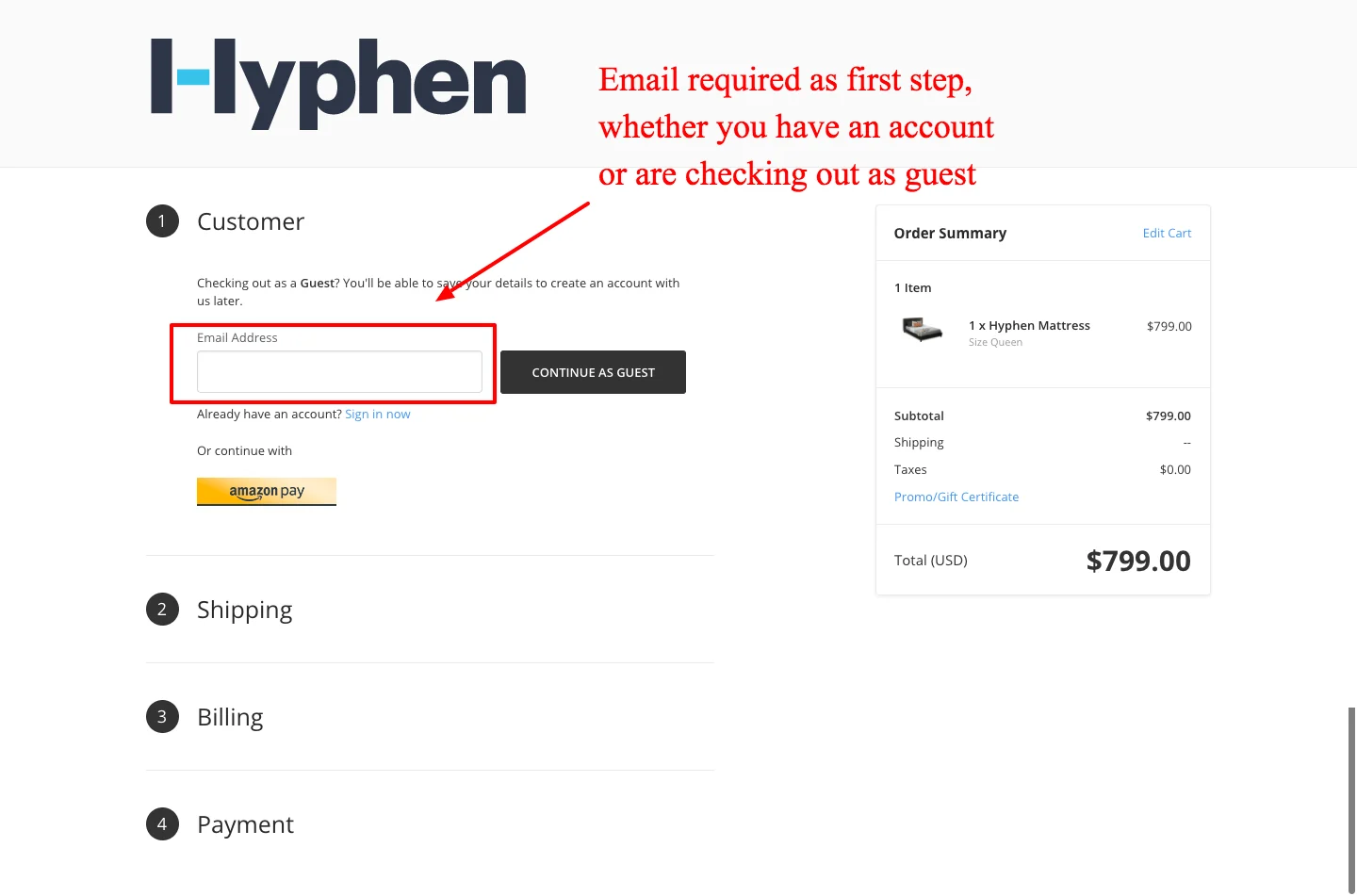
The main objective behind grabbing the email address is for shopping cart abandonment campaigns. Without an email, you cannot launch your abandoned cart email series, which often brings back 15% of customers who add an item to cart, get to checkout and then decide not to purchase.
I’m also a big fan of systems like DotMailer and Ometria, which require a user to enter their email address in order to tie their behavior to a user, which allows for more personalized email marketing.
Using connections built by companies like Windsor Circle for BigCommerce –– or whichever ecommerce platform you use –– will allow you to sync data in real-time between your online store and a more personalized email provider like DotMailer.
Here is a backend view to show you exactly what you can do to implement this process. Keep in mind, this only works if you grab email addresses early and often.
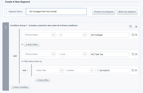
Easily create marketable customer segments based on specific behavior.
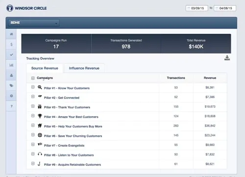
Track how those segments perform.
If don’t need abandoned cart segmentation that’s so advanced, capturing the email address early in the process is still incredibly important to trigger regular abandoned cart flows. You can set those up out-of-the-box with BigCommerce or through other email providers like MailChimp, Dotmailer and Klaviyo.
The Math behind Abandoned Cart and 25% More Revenue
Abandoned carts happen. Here’s how to get those customers back and reduce abandonment rate.
2. Replace or minimize the header and footer, and remove any other distractions
This tactic helps to address issue #3 in our abandoned cart list above.
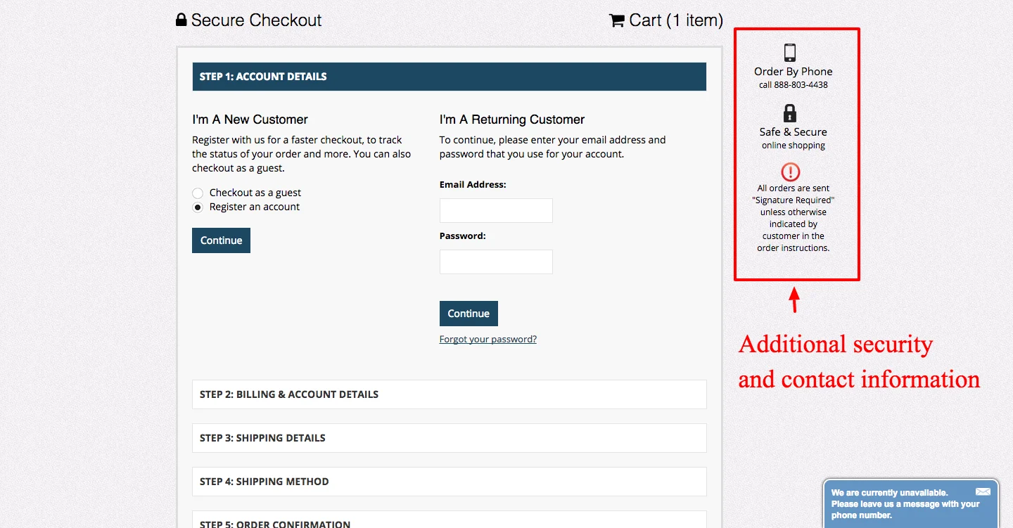
I’m a big advocate of removing the core header and footer navigation of the store, in order to prevent any distractions for the user. The focus of the checkout page should be — well, the checkout page.
Generally, I’d recommend swapping the header for important links (such as delivery information, which should open within a lightbox / modal) and trust signals (such as secure payment gateway, merchant reviews etc, etc).
Berkey Water is a really good example of this. I’d also often display a link back to the main cart / main store and a phone number or live chat field for questions.
Couture Candy is another good example of checkout simplicity. In addition to removing all distractions, the brand also pulls the cart summary information down as you progress through the fields, which I like.
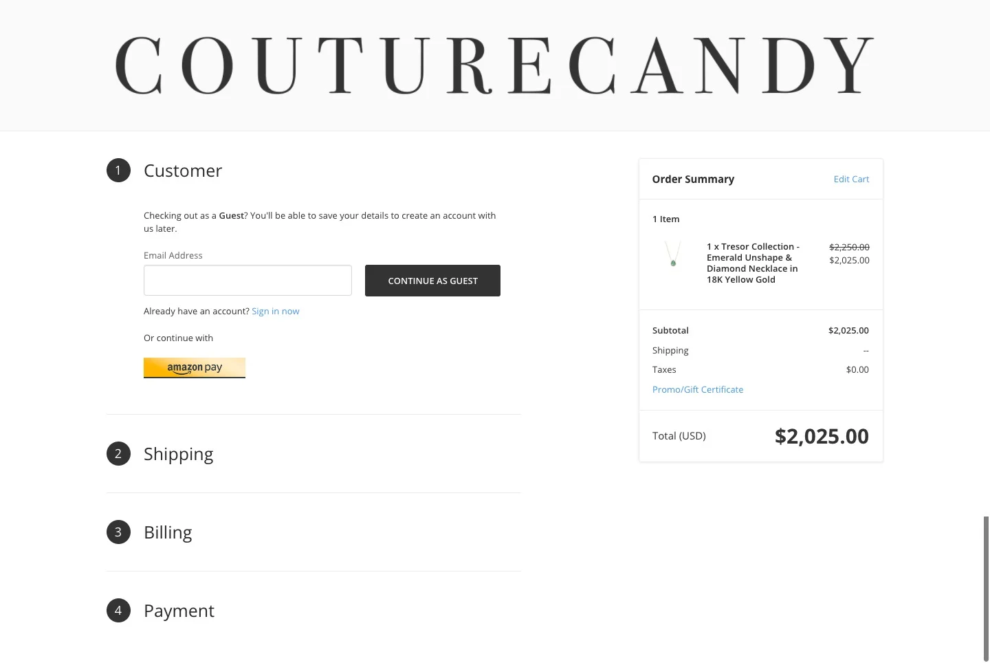
Out-of-the-Box Optimized Checkout
BigCommerce’s optimized checkout is free to use for all BigCommerce customers and is an out-of-the-box feature. Simply choose “optimized checkout” for your checkout option on the backend, and your checkout will look like Couture Candy’s.
3. Keep your cart page / process quick and simple
This tactic helps to address issue #3, #4, #7 and #8 in our abandoned cart list above.
With the cart and basket pages, the key is to keep things as simple as possible. Summarize what the user has added to cart and provide a very obvious next step (as well as options around making changes to the order). Only include custom fields that are absolutely necessary, since these naturally provide more shopper friction.
Remove unnecessary clutter and make the call to actions on the page very obvious and clear. If the next step is to choose shipping method, it should be self-explanatory to the customer. They shouldn’t have to strain to determine where to enter their shipping address or other information. Some type of progress indicator can be useful here as well.
Sierra Designs has a very strong cart page, which I’d imagine is based on a lot of research and data that positively impacted conversion. I think this cart page is a great example of providing a summary of the order and a very obvious next step for the user to progress through to the next stage of the checkout.
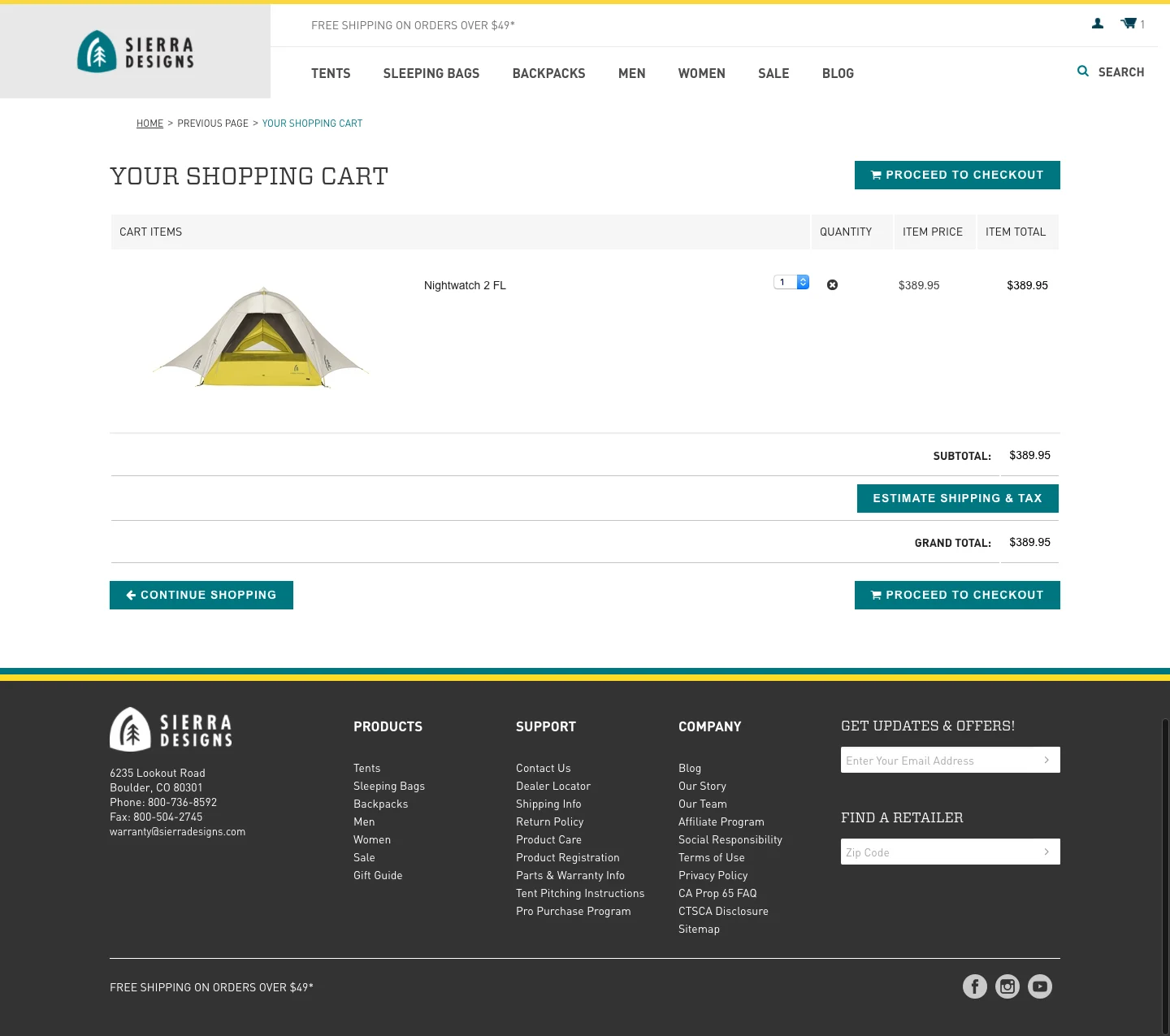
See that button in there that allows users at this stage to calculate total order cost. Include that. Here’s what that looks like.
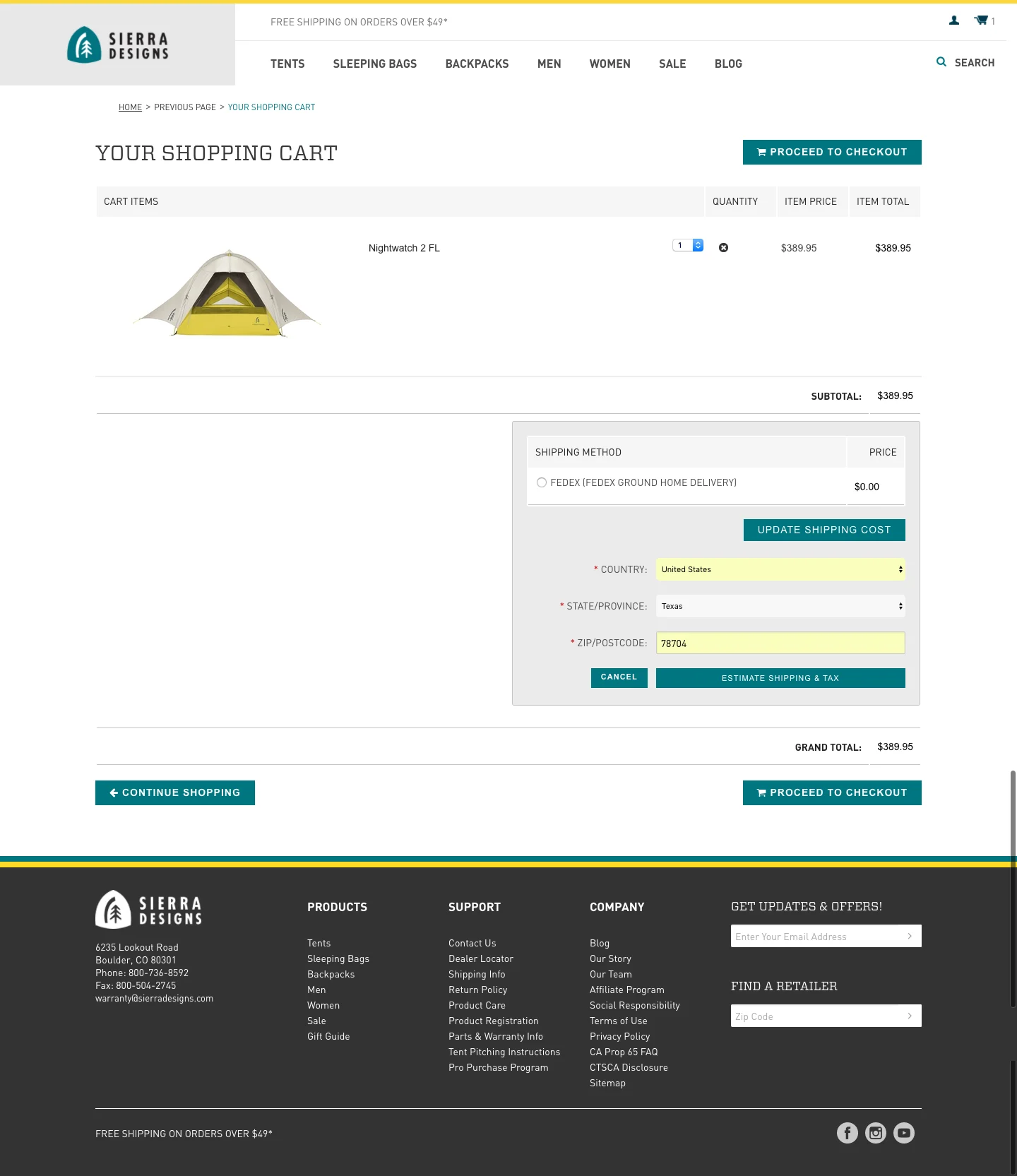
Another key part of this is the process of adding an item to cart, which should again be a very clean experience that doesn’t impact the user’s journey by taking them straight to the cart page when they’re wanting to purchase another item.
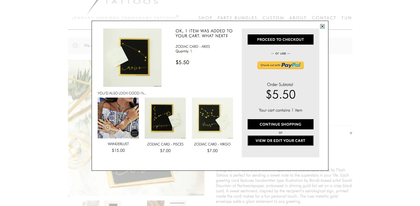
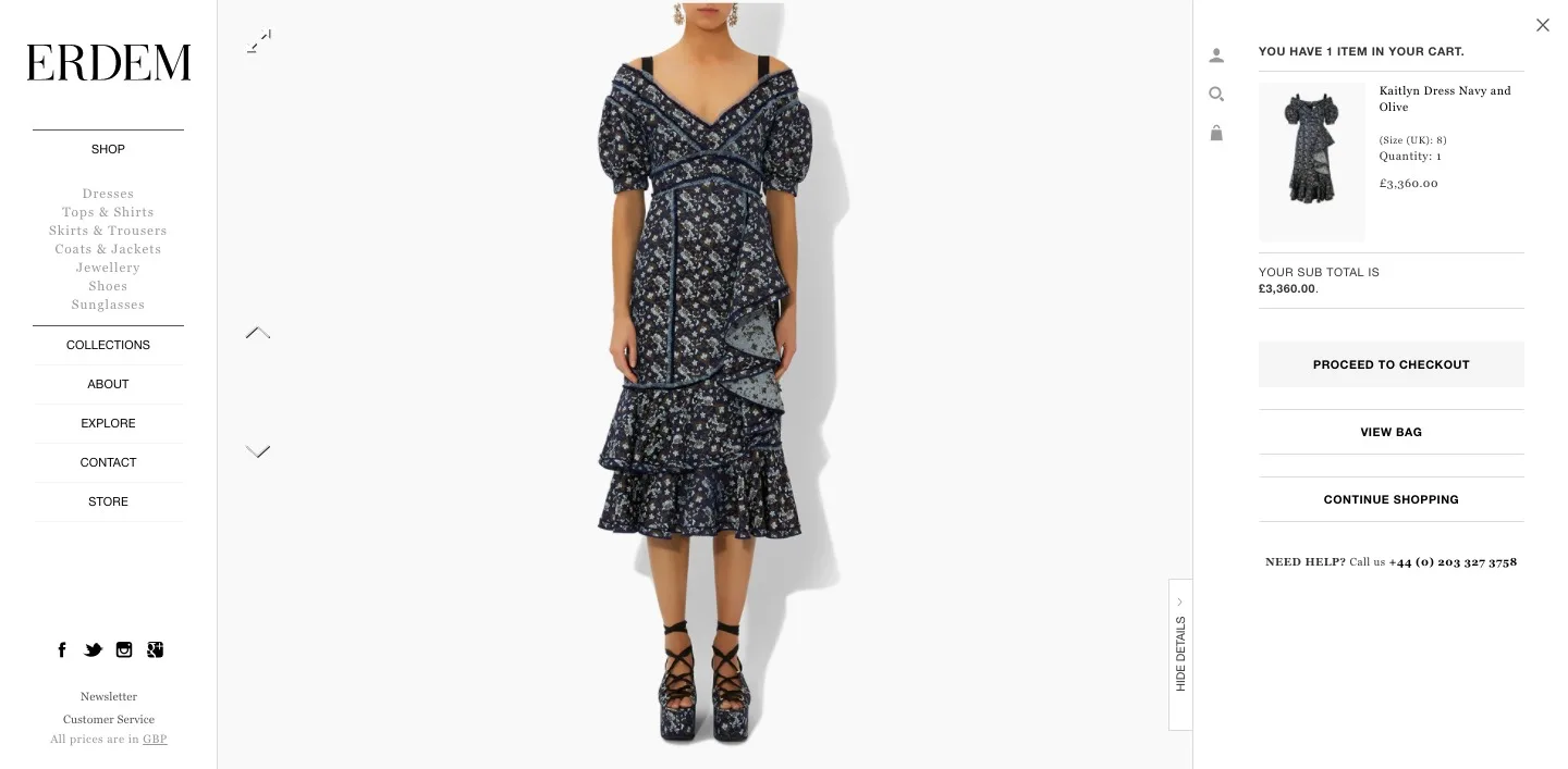
Two really good examples of this are Flash Tattoos and Erdem.
Flash Tattoos displays a modal window when an item is added to cart. This window lets the brand cross-sell to increase AOV and conversion rate, but doesn’t force a user into the cart just yet.
Erdem doesn’t provide a pop-up, but instead notifies the user of an item added in the right hand corner column of the site.
How to Write a Returns Policy That Sells
Be customer-centric. Also, use this template.
4. Data validation
This tactic helps to address issue #3, #5, #9 and #10 in our abandoned cart list above.
From experience, address validation solutions are a great way to speed up the checkout process and also reduce input errors.
This has been a fairly common addition to checkouts in recent years and PCA Predict in particular has done a great job in creating an easy to integrate, robust solution. Many web browsers like Chrome and Safari also store this information for users on their own end, which looks like this:
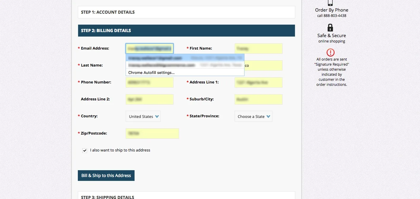
All of those yellow slots were filled in by Chrome.
Also, it’s helpful for international merchants to use a service or platform that allows you to recognize IP address and automatically change currency to fit the bill.
Here is an online record store based in The Netherlands. As you can see, the currency alters based on IP address (this user was visiting from the U.S.).
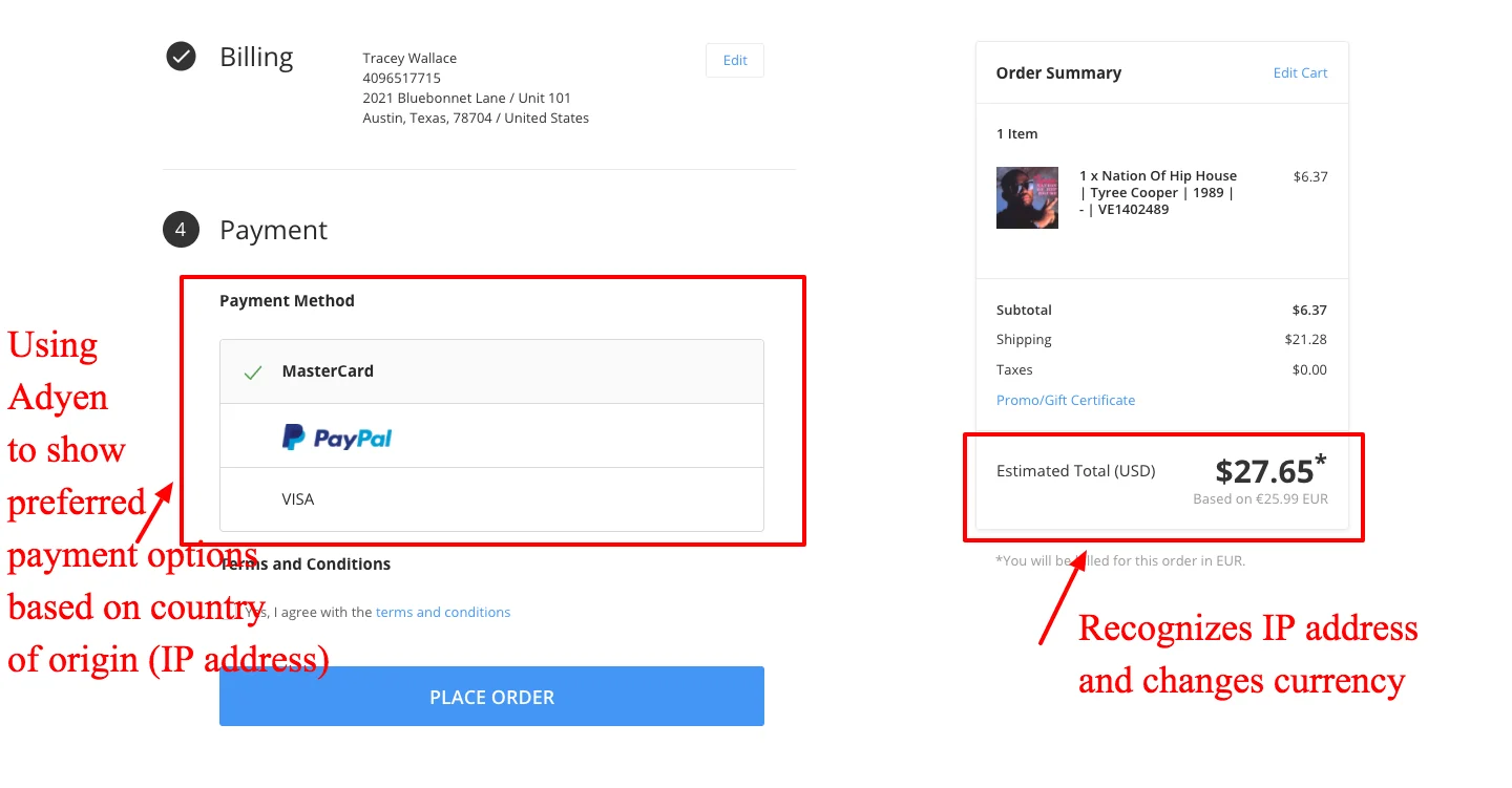
In addition, the payment options altered based on IP address using Adyen. In The Netherlands, Ideal is the most common payment option. In the U.S., regular credit card providers and PayPal are most popular. Vinyl Express set up rules on the backend of their store through Adyen to enable this and decrease customer confusion or distractions.
5. Display trust signals throughout the checkout process
This tactic helps to address issue #6 in our abandoned cart list above.
Trust Seals
Users really start to think about security when they reach the most sensitive parts of a webpage. For online shoppers, it’s when they reach the credit card form field on a webpage that they are on guard in terms of the of what the security of a page is actually like.
Showing trust signals throughout the buyer journey is something that comes across as very obvious, but isn’t always implemented on websites.
I recommend displaying the following:
Merchant reviews / rating (e.g. rated 4.9 / 5 based on 100,000 orders)
SSL certificate and mention of secure shopping experience. You could also potentially look at third party security validation, such as Norton, McAfee, GeoTrust etc
Very clear customer service / help, returns and T&Cs links
Logos of available payment options (and ideally payment certification – e.g. verified by Visa)
Any other business accreditations
Which trust seals should you use?
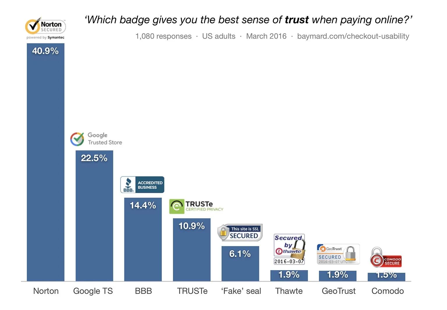
The Baymard Institute has done two studies on which trust seals invoke the highest amount of security for users. Their first test was in 2013 and the second in 2016. They compared all sorts of seals –– including ones from the Better Business Bureau and Google’s own Trusted Store seal, as well as those from SSL vendors like Symantec, Comodo, Thawte, etc.
What they saw was that consumer facing security brands score a lot higher in terms of perceived trust –– and not just 2% higher, but 2x.
What is a consumer-facing security brand? It is often those brands which provide antivirus software like Norton/Symantec and McAfee, as well as Google and the BBB, that rank really highly in a user’s perceived level of trust. Pure-play SSL providers like GeoTrust, Comodo and Thwate generally don’t do as well –– likely because consumers haven’t heard of them.
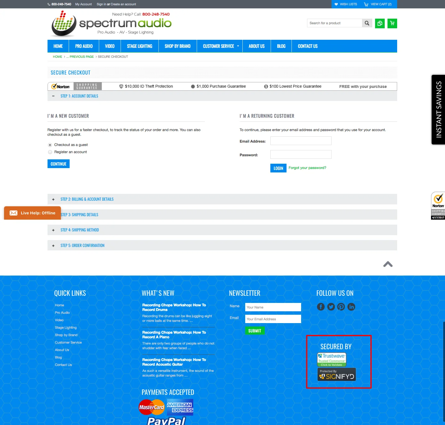
The Spectrum Audio screenshots below represents a good example of how trust signals can be used throughout the buyer’s journey.
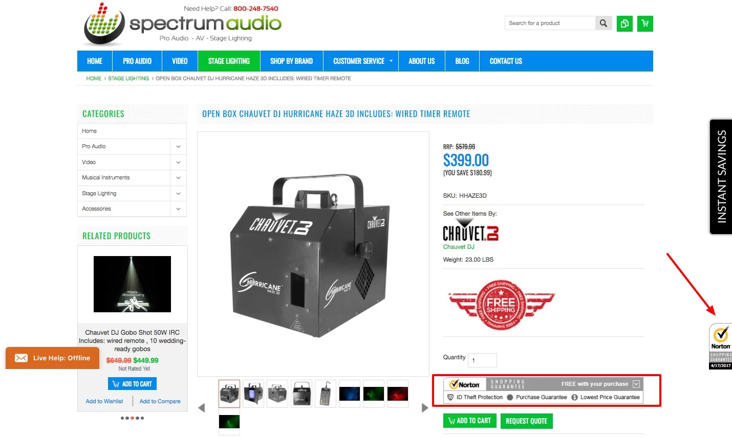
Product page
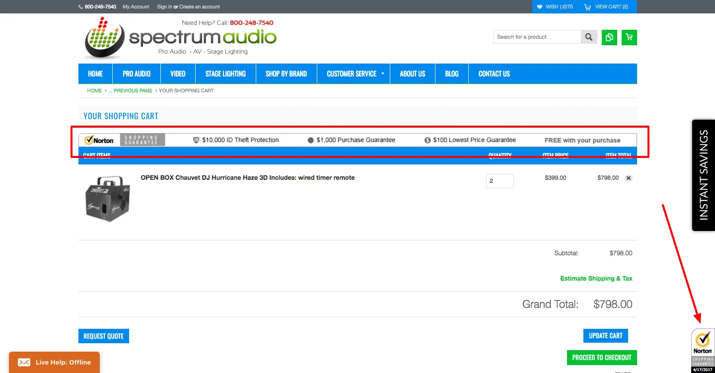
Cart page
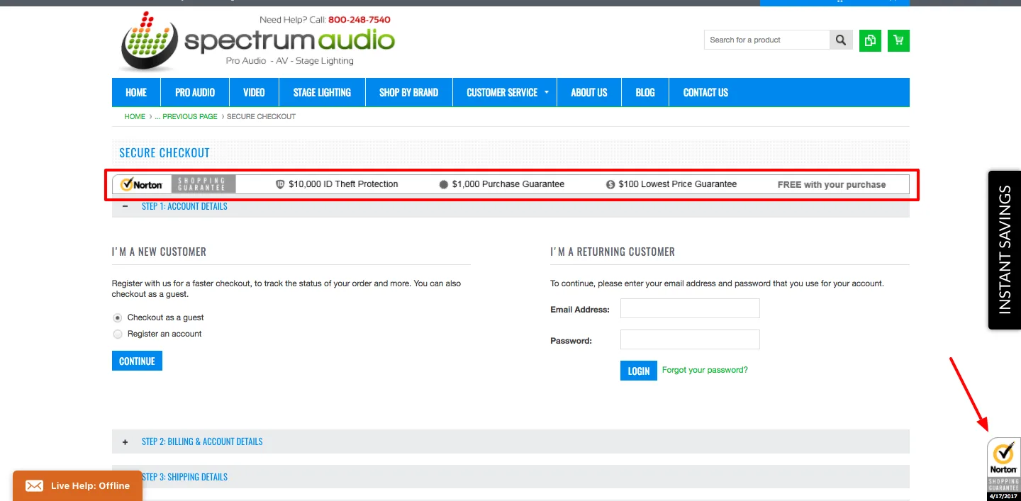
Checkout page
Spectrum Audio also retains their footer (replacing the header with contact details), which has various certifications and accreditations.
Streamlined Domain Experience
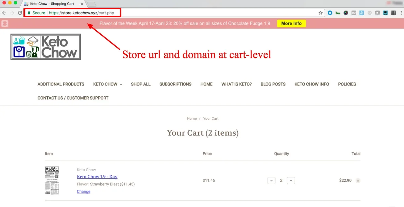
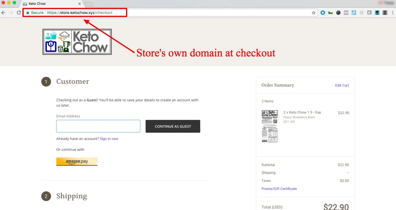
Another important thing retailers can do to establish trust and increase conversion rate at the checkout page is to keep customers on their domain through the entirety of the shopping experience.
You’ll see that some websites across the web will jump you to a third-party checkout provider, rather than keeping the customer on their own domain. This is often because the business hasn’t purchased an SSL and is using a shared SSL through a third-party. While this is secure technically, from a perception angle, it can disrupt the user flow and cause distrust.
Here is how the checkout flow works for brands using their own SSL:
Free SSL at Checkout Coming Soon to All
All BigCommerce stores are outfitted at launch with a shared SSL certificate by default, which uses the .mybigcommerce.com domain. As a result, your secure pages, like the cart and checkout page, will have a URL containing store-xxxxxx.mybigcommerce.com.
To display your store’s custom domain continuously throughout the checkout process (which is often preferred by shoppers concerned about security) you can purchase a dedicated SSL certificate. In the coming months, BigCommerce customers will have access to a free SSL certificate, removing the need to purchase an SSL for checkout domain continuity.
6. Allow for different payment options
This tactic helps to address issue #9 and #10 in our abandoned cart list above.
Another key thing to think about are the payment options you’re providing to customers, which has become a much bigger area in the last couple of years due to the shifting finance industry. Customers have varying affinities and loyalties to different providers, so the more payment fields, the better.
Lots of the larger retailers are now offering things like pay after delivery, credit (either with 0% API or at a cost), split payments, etc, which are gradually becoming more important to users.
Klarna
Finance in particular is an interesting one. I’ve recently looked at Klarna with a number of clients, which is an excellent solution. The below example shows the UI of Klarna checkout on the ZenProAudio.
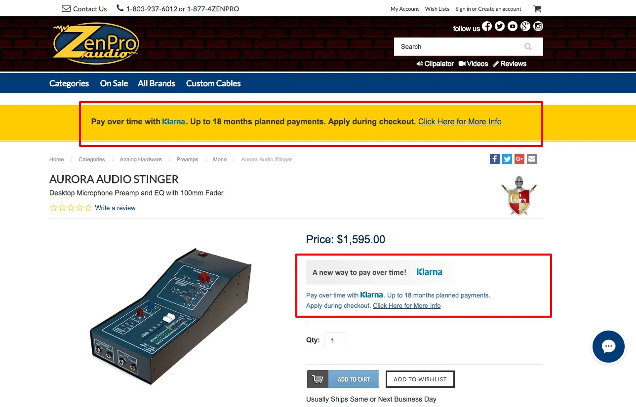
Product page
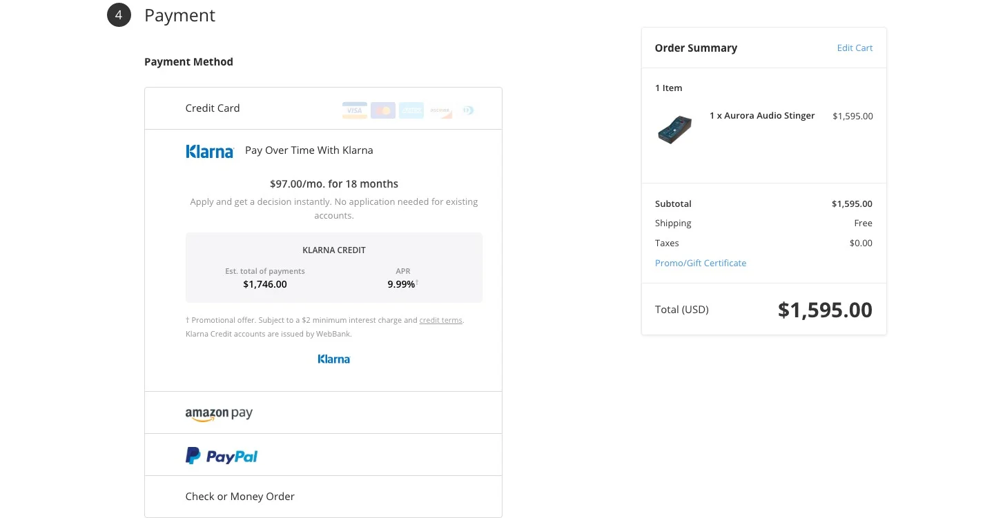
Checkout page
There are a number of reasons why I recommend Klarna to merchants. The main ones are:
Speed – Klarna checkout is rapid and, if you’ve used Klarna before, it remembers your details. It’s a relatively similar experience to PayPal.
Credit offering – Klarna have a very strong credit and ‘pay after delivery’ offering, which can have a really big impact on a merchant’s conversion rate.
Experience – The full Klarna checkout provides a very nice UX and is basically a very clean, optimized checkout page out of the box.
Klarna + BigCommerce
Are you a BigCommerce customer? Start using Klarna right now.
Outside of Klarna, there are lots of other payment methods that could make a difference to your business. Be it something like AliPay, which is very important if you’re selling in Asia, or a finance option if you’re selling high value items.
Adyen
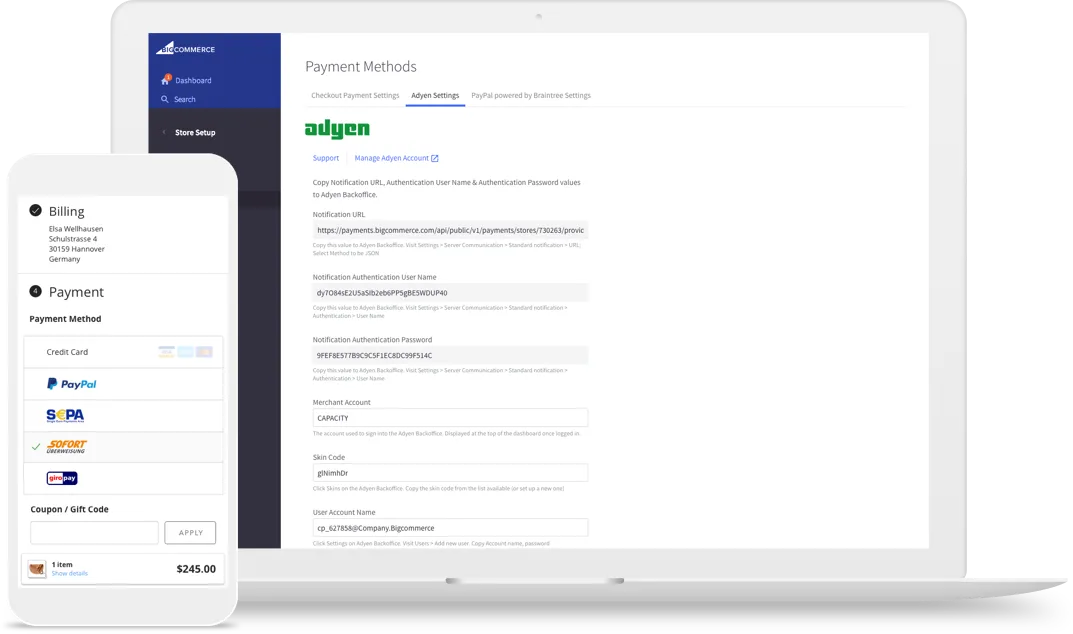
For international sellers looking to showcase payment options for particular regions, use a solution like Adyen that lets you set rules for IP addresses so customers don’t have to scan hundreds of options and can instead choose from their region’s top few.
All countries have their nuances, which is why it was so important we used Adyen with BigCommerce. Adyen supports a large volume of sales, and allows customers to choose their preferred payment method without cluttering up the checkout flow with a bunch of different payment options.
Adyen + BigCommerce
Accept preferred payments worldwide. Begin using Adyen right now.
Digital Wallets: Apple Pay + Amazon Pay
Also, look into digital wallets like Apple Pay and Amazon Pay. For many brands using Amazon Pay at checkout, they have seen conversions skyrocket, with more than 20% of customers choosing Amazon Pay over all other options.
Digital wallets are particularly impactful for mobile commerce metrics.
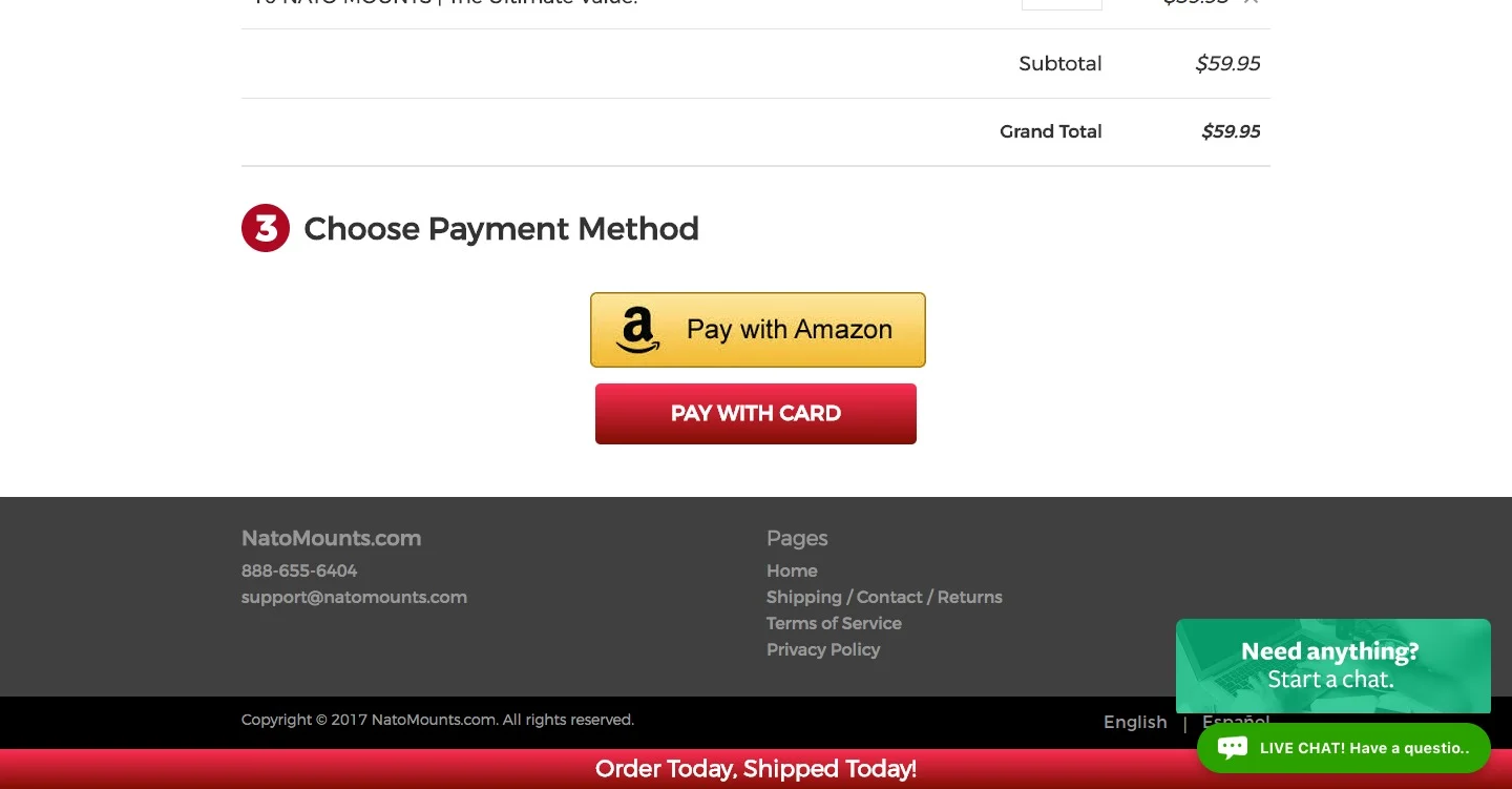
One BigCommerce merchant, NatoMounts, had a customer land on the site and checkout in less than 30 seconds thanks to Amazon Pay.
By building these integrations with companies like PayPal and Amazon, BigCommerce provides non-household brands, like me, instant credibility. This equals a clear path to ~5% conversion rates on mobile with over 80% of sales on mobile.
See Why So Many Brands Love Amazon Pay
What 10+ brands have to say about Amazon Pay, including sales lift in as little as two weeks.
Final Word
All in all, your ecommerce checkout page is the most important part of your online store. You cannot win sales and grow your business if you cannot get consumers to convert.
This is where trust is the most important. This is also where every small error or distraction can have a serious impact on your bottom line. Get as much feedback from customers on the user experience as you can, which helps you to identify every possible area to reduce friction and optimize your checkout page.
Streamline your checkout page. Offer all available, convenient solutions for your customers and make checkout the least difficult part of your customer’s ecommerce journey — from visit to conversion.

Paul Rogers is an experienced eCommerce & Digital Consultant who focuses on replatforming projects, eCommerce technology and customer acquisition strategy. Paul mostly works with mid-level merchants and is also involved with search technology startup, Klevu.